
My colleague Sam Hinton and I began work on this as a project for MashupAustralia late last year. Our initial focus was the Flickr set of the State Library of NSW, and our aim was a rich, dynamic, "show everything" interface, building on the A1 Explorer work, but with image-based content. Some months later, having totally missed our original deadline, the scope had broadened out to the whole (amazing) Flickr Commons.
The explorer consists of a three-pane interface. The term cloud shows the 150 most frequently occurring words in the titles (not tags) of the current set of images. This will look familiar to anyone who's played with the A1 Explorer. It uses the same co-occurrence visualisation, and the same blocking / focusing navigation, with a few UI refinements. After some strong user feedback, I added a "back" button to step the navigation back one state. It also uses left and right-clicks, rather than modifier keys, to block or focus words. Applying this title-word approach to different sets has shown up its strengths, and a few weaknesses.

Its strengths are that titles and co-occurrence are a reliably rich cue for content, and that for most collections, thanks to the wonder of Zipf's law, the top-level cloud of 150 words will "cover" (refer to) more than 75% of the images in the set - even in a collection numbering in the thousands. Often, in smaller collections, the coverage is more than 95%. One question I haven't answered yet is how to communicate this idea of coverage to the user, and how to make those images not in the top level cloud, more immediately discoverable. Because after all, sometimes it's the outliers or exceptions in a collection, that we are interested in.
The bottom pane is the thumbnail grid, which is where most of the new stuff is. The grid is an attempt at a "show everything" image visualisation that can scale from tens to thousands of elements. As the number of elements grows, the grid size decreases to fit in the available space. Rather than scale images down, we simply crop the thumbnails - the intention isn't to represent the whole image but to provide some rich but unstructured visual clues: a sort of visual core sample through the whole set. The results show how this can help reveal structure within the collection. Different photographic processes are instantly apparent - monochrome, sepia, cyanotype, stereoscopic, Kodachrome. Other similarities also pop out, even in small tiles - landscapes vs portraits, for example.

This "clue" approach actually sums up our visualisation approach nicely. The Explorer presents us with a rich mass of partial information - or rather data: linked fragments of titles, and of images. Moments of discovery come when we see those fragments unified in a source image: the fragments are contextualised and become more meaningful. This contextual information then propagates back to the fragmentary display - when it works best there is a feedback loop from discovery to context and back to discovery. I've argued for a distinction between data and information, which is relevant here: these fragments are data points, abstracted and decontextualised. Information occurs only when we link and interpret those fragments - and it happens strictly on the human side of the screen.
Another feature of the grid that isn't immediately obvious is chronological sorting. Many collections, including the SLNSW set we started with, include dates in image titles. We look for those dates and sort dated images first in the grid. This approach is simple, and prone to the occasional false positive, but it degrades gracefully, and adds a usable layer of structure to the grid layout. Why not use Flickr's "date taken" field instead? Most Commons collections don't set it, so instead it gives the date uploaded. For the same reason we decided not to use tags, or attempt to scrape data from descriptions: these fields are inconsistent across the Commons - some images have no tags, others have dozens. Title and thumbnail seem to be the richest data that is always available.

Sam Hinton did the heavy programming work that makes the grid go. The main technical challenge we faced was memory usage: loading 700 tiny images just eats memory in Processing / Java. Sam devised a system for stashing the square thumbnails locally, optimising memory and acting as a cache to speed up loading. Drawing thousands of little images to the screen also raised performance issues - we draw to a single offscreen PGraphics context, then draw that to the screen.
In the end I think we've done what we set out to do - make a rich experience that encourages an understanding of context, and enables discovery in large collections. We've also shown that this approach is broadly applicable - if you've got a large image collection where you think it might apply, let us know. Most importantly though, try it out and let us know what you think.
Download commonsExplorer for Mac | Windows | Linux (1Mb)
Up to this point the grid visualisations have taken a very simple approach to space: dividing it up equally among the data points, and then using hue and brightness to show attributes such as shelf metres and items. This has the advantage of simplicity, but it has a major disadvantage too: it's attempting to represent size (shelf metres or number of items) using other means. Why not just use size for size? Read on for the blow-by-blow account, or skip straight to the end result: the latest interactive sketch.
Before Christmas I had a first stab at this problem. The approach was basic, as usual. Maintaining the chronological ordering of the series, I drew each series as a square with area proportional to number of items. The packing procedure was simply: starting where the previous series is, step through the grid until we find a big enough space to draw the current series. The result looked like this: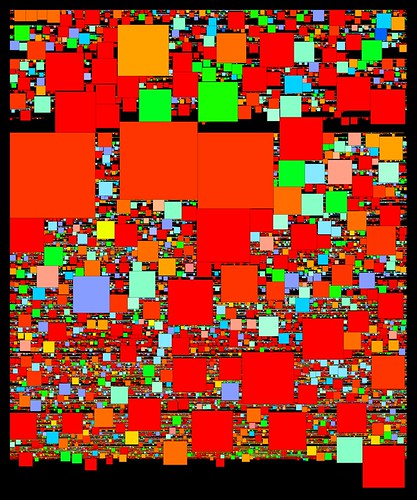
The main restriction here is the chronological ordering of the series. I need to maintain that ordering, but at the same time I need to be able to pack the squares more efficiently, which means changing the order. Luckily there's a loophole: as the first histogram showed, many series share the same start date. So we can change the sequence of those same-year series, without disrupting the overall order. We can pack them starting with the biggest squares and pack in the smaller ones around them. The latest sketches use this method, which can be described in pseudocode:
- Make a list of series with a given start year
- Working from biggest to smallest, pack each series into the grid, from a given start point: restart the search from the start point each time.
- Keep track of the latest point in the grid that this group occupies. For the following year, start from this point.
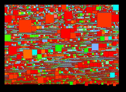 In this image square area is mapped to shelf metres; as in the earlier sketch hue is derived from the series prefix (roughly A = red, Z = blue). One artefact is apparent here - those lines of squares graded by size occur when nothing gets in the way of the packing process. As a byproduct of this, the biggest squares in those sequences often mark the start of a new year in the grid.
The latest sketches integrate both shelf metres and described items, and finally add interaction to this visualisation. To combine metres and items the squares are drawn as above, with area proportional to shelf metres; then overlaid with a second grey square, whose size is inversely proportional to the number of items in the series. The result is that series with many items are full of colour, and series with few items have large "hollows" and narrow coloured borders.
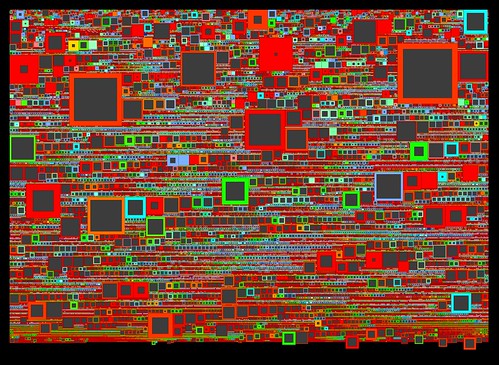 Again, there are relations between series here that are instantly apparent. It's easy to see those series that have lots of shelf metres but relatively few items, as well as even medium-sized series with many items. I couldn't find A1 in the earlier grids (though Tim Sherratt from the Archives could); it is much more prominent here. Tim also pointed out that B2455, one of the big series of WWI service records, didn't jump out of the grids: it's very prominent here. As well that cluster of post-War migration series spotted in the items grid reappears here. Promising signs for the usefulness of this visualisation.
All this is best demonstrated in the interactive version, which like the previous grids adds a caption overlay and some year labels on the vertical axis. Browse around and see what you can find - feedback very welcome.
After being completely buried under end-of-year admin for a few weeks, it's great to be back to work on this project. I've been working on plumbing in the latest dataset from the Archives, which has doubled in size to around 57,500 series. In an attempt to create a browsable overview of the whole collection, I have been developing the earlier grid sketches, feeding in more data, and extra parameters. Also new in this dataset are two interesting features of archival series: items - number of catalogued items in the series - and shelf metres - the amount of physical space the series occupies. In this interactive browser, you can navigate around the whole collection, and switch between modes that display these parameters.
A brief explanation. Like the earier grid, series are sorted by start date (still contents start date, rather than accumulation, for the moment) then simply layed out from top left to bottom right. In this version I've added some year labels on the Y axis, which show the distribution of the series through time. Hue is mapped directly to date span: red series have a short date span, blue have a long span. The four modes in this interactive change the mapping for brightness. In the default display brightness is mapped to items (I); M switches the brightness key to shelf metres; P shows items per shelf metre; and S switches the brightness key off (showing span/hue only).
Both these new parameters have a wide range and a very uneven distribution, and as you can see in the visualisation there are many series with zero items and/or zero metres. In fact around 30000 series (over half this collection) have zero digitised items; while around 2600 have between 100 and 1000 items, and 13 have more than 10000 items. Around 20000 series have zero shelf metres, around the same number have 0.1-1m, around 10000 have between 1m and 10m, and the rest have more than 10m - with a couple of dozen series with more than 1km of shelf space! It's important to remember, as Archives staff have mentioned to me, that items here refers to digitised items. Series with zero listed items aren't empty, they just haven't been digitised. Similarly I suspect that a value of zero shelf metres suggests that the data doesn't exist. Even if it can't be taken at face value, items is an interesting metric because the Archives digitises records largely on the basis of demand from users; so a series that is frequently requested is more likely to be digitised. Items, then, is partly a measure of how interesting a series is, to Archives users.
The items view of the grid allows us to see, for example, that there are more digitised items in series commencing in the 20s and 30s, than there are in series commencing in the 60s and 70s. We can also see a dense band of well-digitised series from the late 90s onwards. I don't know, but I'd suspect that these are "born digital" records - no digitisation required. The most striking feature of the items graph is the narrow red streaks around 1950: these are Displaced Persons records from 1948-52, each series corresponding to a single incoming ship (above). These records show up here because they are well digitised (interesting) but also because there are many sequential series forming visual groups. There are other pockets of "interestingness", but they are less obvious. This reveals one drawback of this grid layout, which is that related series are not necessarily grouped together. I'm hoping to address this when I start looking at agencies, functions, and links between series.
A few technical notes. After running into problems storing data in plain text, I changed the code to read the source XML in, pick out certain fields or elements, and write the data back out as XML. I used Christian Riekoff's ProXML library for Processing, which makes the file writing part very easy (Processing's built-in XML functions don't include a file writer). This worked well, except when it came to exporting web applets, which just refused to load. Rummaging around in the console log, and turning on Java's debugging tools (thanks Sam) showed that the applet was running out of memory while trying to load the XML - admittedly a fairly hefty 27Mb uncompressed. So for the web version at least, I have reverted to storing the data as plain text, which immediately reduced file size and loading time by a factor of 4, and solved the applet problem. Since then Dan and Toxi have suggested alternative ways of handling the XML, such as SAX, which streams the data in and generates events on the fly, rather than loading the whole XML tree into memory before parsing it. I'll be looking into that for any serious web implementation of this stuff.
Finally, with almost 60000 objects on the screen, this visualisation raises some basic computation and design issues. Even using accelerated OpenGL, this is a tall order; I found I was getting around one frame per second on a moderately powerful computer. I have solved the issue here with a simple workaround (thanks Geoff for this one) - pre-render an image of the grid, then overlay the interactive elements. Performance issue solved. But there are some limitations: this approach means the grid layout is fixed. It's a significant move away from a truly "dynamic" visualisation, where all the elements are drawn on the fly. For visualisations at this scale, I don't think there's any other way, but as the design develops I'll be trying to push back towards the live, dynamic approach, as the dataset permits.


I've been considering how to develop the stack histograms, but meantime decided to quickly trial a completely different approach to visualising the Series dataset. I don't want to get carried away with one metaphor / approach, when there may be others worth exploring. So, in this visualisation some 27000 series are layed out in a simple grid. Series are ordered by (contents) start date, and sequenced left to right, top to bottom. As in the last histograms, date span is mapped to hue, so long spans are blue, short spans are red. I've been having some weird issues with web applets so far, but this one seems to work (without OpenGL), so there's also an interactive version to play with.
This layout has a number of advantages over the stack approach. The primary one is visual density. This layout makes it possible to see all the series, in a single visual field. In the examples here the grid is 200 columns wide and around 135 rows high; each series is a 4 x 4 pixel square. Even allowing for 40000 series in an expanded dataset (more of which soon), this scale is functional. A related advantage is browsability. In the interactive version of this sketch, we can simply mouse over series to see their details; a usable, if still unstructured way to browse the collection.
The grid throws away the emergent histogram-form of the stack approach. However many related structures are still apparent: for example the pattern of long-span series having early start dates is clear; and the interactive version also reveals the date distribution; the reddish band in the middle of the grid is the wave of short series around WWII. One thing on the list to try is add a date key to the vertical axis. This would effectively show the same thing as the tall peaks of the original histogram: the relative numbers of series commencing over time. The grid simply structures space according to the data elements (the series), so that the relation of date to visual space becomes nonlinear; but the relationship is still there and easily revealed.
Next on the list of things to try is a word-frequency visualisation based on series titles. This should provide a way to browse the grid more effectively; after that, I need to get to work on a new, expanded dataset with more series, but also useful quantitative measures like shelf space and digitised items, for each series. Then, more layers of structure and browsability: relationships between series, agency and function.
