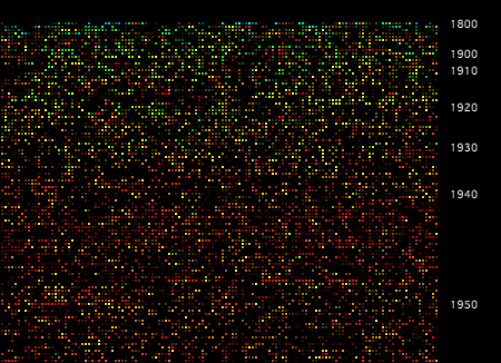
After being completely buried under end-of-year admin for a few weeks, it's great to be back to work on this project. I've been working on plumbing in the latest dataset from the Archives, which has doubled in size to around 57,500 series. In an attempt to create a browsable overview of the whole collection, I have been developing the earlier grid sketches, feeding in more data, and extra parameters. Also new in this dataset are two interesting features of archival series: items - number of catalogued items in the series - and shelf metres - the amount of physical space the series occupies. In this interactive browser, you can navigate around the whole collection, and switch between modes that display these parameters.
A brief explanation. Like the earier grid, series are sorted by start date (still contents start date, rather than accumulation, for the moment) then simply layed out from top left to bottom right. In this version I've added some year labels on the Y axis, which show the distribution of the series through time. Hue is mapped directly to date span: red series have a short date span, blue have a long span. The four modes in this interactive change the mapping for brightness. In the default display brightness is mapped to items (I); M switches the brightness key to shelf metres; P shows items per shelf metre; and S switches the brightness key off (showing span/hue only).
Both these new parameters have a wide range and a very uneven distribution, and as you can see in the visualisation there are many series with zero items and/or zero metres. In fact around 30000 series (over half this collection) have zero digitised items; while around 2600 have between 100 and 1000 items, and 13 have more than 10000 items. Around 20000 series have zero shelf metres, around the same number have 0.1-1m, around 10000 have between 1m and 10m, and the rest have more than 10m - with a couple of dozen series with more than 1km of shelf space! It's important to remember, as Archives staff have mentioned to me, that items here refers to digitised items. Series with zero listed items aren't empty, they just haven't been digitised. Similarly I suspect that a value of zero shelf metres suggests that the data doesn't exist. Even if it can't be taken at face value, items is an interesting metric because the Archives digitises records largely on the basis of demand from users; so a series that is frequently requested is more likely to be digitised. Items, then, is partly a measure of how interesting a series is, to Archives users.
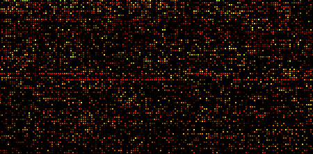
The items view of the grid allows us to see, for example, that there are more digitised items in series commencing in the 20s and 30s, than there are in series commencing in the 60s and 70s. We can also see a dense band of well-digitised series from the late 90s onwards. I don't know, but I'd suspect that these are "born digital" records - no digitisation required. The most striking feature of the items graph is the narrow red streaks around 1950: these are Displaced Persons records from 1948-52, each series corresponding to a single incoming ship (above). These records show up here because they are well digitised (interesting) but also because there are many sequential series forming visual groups. There are other pockets of "interestingness", but they are less obvious. This reveals one drawback of this grid layout, which is that related series are not necessarily grouped together. I'm hoping to address this when I start looking at agencies, functions, and links between series.
A few technical notes. After running into problems storing data in plain text, I changed the code to read the source XML in, pick out certain fields or elements, and write the data back out as XML. I used Christian Riekoff's ProXML library for Processing, which makes the file writing part very easy (Processing's built-in XML functions don't include a file writer). This worked well, except when it came to exporting web applets, which just refused to load. Rummaging around in the console log, and turning on Java's debugging tools (thanks Sam) showed that the applet was running out of memory while trying to load the XML - admittedly a fairly hefty 27Mb uncompressed. So for the web version at least, I have reverted to storing the data as plain text, which immediately reduced file size and loading time by a factor of 4, and solved the applet problem. Since then Dan and Toxi have suggested alternative ways of handling the XML, such as SAX, which streams the data in and generates events on the fly, rather than loading the whole XML tree into memory before parsing it. I'll be looking into that for any serious web implementation of this stuff.
Finally, with almost 60000 objects on the screen, this visualisation raises some basic computation and design issues. Even using accelerated OpenGL, this is a tall order; I found I was getting around one frame per second on a moderately powerful computer. I have solved the issue here with a simple workaround (thanks Geoff for this one) - pre-render an image of the grid, then overlay the interactive elements. Performance issue solved. But there are some limitations: this approach means the grid layout is fixed. It's a significant move away from a truly "dynamic" visualisation, where all the elements are drawn on the fly. For visualisations at this scale, I don't think there's any other way, but as the design develops I'll be trying to push back towards the live, dynamic approach, as the dataset permits.
Labels: documentation, grid, interactive, sketch, xml
Unknown said...
Actually, I think the numbers of items are actually the numbers described on RecordSearch, rather than the numbers digitised.
When records come into the Archives' custody, series registrations are created. But whether or not the records are described at item level depends on questions of resources and demand.
To complicate matters further, often only part of a series will be described at item level. For example, if someone puts in an access request for an item then an item description will be created. This means you can end up with series that have 200m of records, but only 5 items.
The reason why more recent series tend to have more item descriptions is, as I understand it, because the Archives was able to import data from the recordkeeping systems of the depositing agencies.
Hope that makes sense!
12 December 2008 at 2:22 pm
Unknown said...
I was also wondering whether it might be better to use the 'accumulation date' rather than the 'contents date'. Contents dates seem a bit unreliable and can be skewed by a single document. If you used the accumulation date I think there would be a more even and meaningful spread of colours.
And, well, it's Friday afternoon and we've been playing 'find the series'. I correctly guessed the colour and brightness of A1 and managed to find it despite the scepticism of my colleagues.
12 December 2008 at 3:47 pm
Mitchell said...
Thanks Tim. I'm impressed (and pleased) you spotted A1, I couldn't find it at all!
I will do a version using accumulation dates, which is easy enough, and we can look at the differences.
Re. item numbers, is there anything we can say then about series with more or less registered items? If it's partly a decision made at the time of registration, is there some relation between the perceived significance or "interestingness" of the series, and the number of items registered?
13 December 2008 at 3:03 pm
Unknown said...
There have apparently been many systems in place for determining which series are described in detail, but little codification. So understanding why a particularly series was described might itself require historical research.
However, if you have a large series (ie in shelf metres) in which only a small number of items are described then you could ascribe that to researcher demand. Indeed, it is perhaps evidence that a 'serious' researcher has been at work, because they would have had to put in a fair bit of work to find and request the record.
For some insight into description policies, you might want to have a look at this paper by Brendan Somes which gives a good summary of the issues.
13 December 2008 at 5:01 pm
Unknown said...
And I may have been lucky with A1... I haven't been able to find B2455 (visualised in a rather different form in Mapping our Anzacs). With 375,900+ records described, it should be amongst the brightest stars in your firmament.
Would it be possible to vary the brightness according to a logarithmic scale, so that series with hundreds of thousands of items would stand out from those with a few thousand?
13 December 2008 at 5:27 pm
Unknown said...
Me again... sorry to deluge you with comments, but I've been walking around the supermarket thinking about your grid. In particular, the items per shelf metre view.
One oft-quoted statistic is that only about 10% of the NAA's collection is described at item level on RecordSearch. A lot can be done to make people aware of that 10%, through exhibitions, guides, web features, but how do you make people aware of what's not there -- to perceive the vast bulk of the iceberg out of sight beneath the water?
The items described per shelf metre view offers some possibilities here, though it would be good to have some way of filtering it to highlight those series with significant amounts of holdings (so that a series with 1 shelf metre and one item described looks different from a series with 100m and 100 described). If you are an experienced researcher, you get in the habit of checking the shelf-meterage of a series where only a few items are showing up. This sort of visualisation might make this process more intuitive.
What would be nice, however, would be to reverse the brightness scale, so that instead of being black holes, series with only a few items described shone like supernovas, inviting researchers to explore their mysterious depths!
13 December 2008 at 7:10 pm
Mitchell said...
Lots of good ideas Tim.
The brightness scale is currently logarithmic - specifically brightness for shelf metres is for example (m + 40*(log(1+metres))) - where m is some minimum brightness level (so that series with zero metres are not completely black). Using 1+metres ensures the result is always positive, and scaling by 40 gives about the right range of values (with a max around 255). This scaling compresses the large range of values (0-1000+ metres) into a smaller range, but also has the effect that a series with 1000 shelf metres is only a bit brighter than one with 100 - in fact the same as the difference between 100 and 10 metres! The same scaling applies to items, but the effect is if anything more dramatic because the range of values is higher (0-100000+).
So I think having the option of a linear brightness scale would make those really big series jump out. I'll try it - again an easy thing to implement.
16 December 2008 at 11:50 am