The latest step in building a browsable Series-based visualisation has been to add in Agency data. The previous post made a first step towards integrating Agencies into the visualisation - essentially using their ID codes to colour the Series squares. But Agencies also offer a powerful way to add context to our visual exploration of the Archives collection, as this post will show. To skip straight to the latest visualisation, download the executables for Mac, Windows or Linux (about 5Mb each - and needs 1280x1024).
To begin with I wanted to get a sense of the quantitative relationships between Series and Agencies. After converting the Series dataset to JSON and ingesting it to Processing, I generated some simple "utility" visualisations.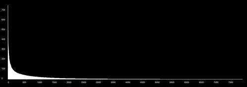
This graph shows all 9000 or so Agencies in my dataset, ranked in order of the number of Series that they record into. Agencies are arranged from left to right along the x axis; number of Series recorded is graphed on the y axis (click the graph to see a larger version over on Flickr). This shape is a classic power law distribution: there are a very small number of Agencies recording a large number of Series, and conversely, very many Agencies recording very few Series. For example, there are only around 100 Agencies that record to more than 100 Series; and the vast majority of Agencies record to very few series (less than 10, say).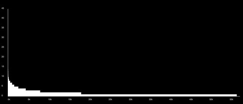
This graph shows the same relationship from the other side: here Series are ranked along the x axis, and the y axis shows the number of Agencies recording into each Series. Again this is a power-law distribution, but the quantities are much smaller. We can see that around two thirds of all Series have only one recording Agency; almost all have fewer than 10; and a tiny number have as many as 45.
Where does this get us, in terms of making a visualisation of the whole collection? It shows that Agencies offer a useful way to break the collection up into manageable-sized subsets; the vast majority of Agencies record to fewer than 100 of the 57.5 thousand series. That's a significant refinement. At the same time most Agencies record to more than Series: so Agencies should be able to show relationships between usefully-sized groups of Series.
The next step was to integrate the full Agency data with the previous Series visualisations; this was relatively straightforward, and again HashMaps were invaluable in cross-linking Series and Agency data. I rebuilt the floating caption display, to handle a complete listing of recording Agencies and their titles. This alone adds a wealth of context to the visualisation: Series with relatively generic titles ("Correpsondence files") are brought into focus with a descriptive list of their Agencies.
For each browsed Series, we can then show other Series recorded to by its Agencies. In the interactive sketch we can select a Series with a mouse click, turn on the Agency display (hit "A"), then scroll through the agencies with the arrow keys. The floating caption box allows us to investigate highlighted Series, select them in turn, and so on. The result is contextually rich and far more browsable than before. The scale of these Agency-based groups is, as the first graphs show, an effective way to break the collection down. The highlights give a slight counterbalance to the size-based bias of the packed-square visualisation, leading us out into smaller series. Also, because the floating caption shows all the Agencies for each highlighted Series, we build up a sense of the range of related Agencies in a certain area; so highlighting CA 51, the (mid-century) Department of Immigration (Central Office), and browsing its Series, reveals other immigration-related Agencies. Have a browse: download the visualisation as a Java executable for Mac, Windows or Linux (about 5Mb each - and needs 1280x1024).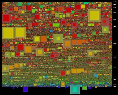
Finally, these latest visualisations also include an important tweak in the packed-square visualisation model. Tim Sherratt commented on an earlier post that the "hollow box" metaphor is potentially misleading, because it's based only on the ratio between shelf metres and recorded items. In other words, the way that a "hollow" suggests un-registered items is just not right. While browsing these visualisations I came across another, more serious problem with the "hollow" approach. Because the overall size of a square is determined by its shelf space, it's possible to have very small squares that represent Series with many thousands of recorded items; as many or more than physically larger Series. The solution is simple, once you think of it: visualise both items and shelf metres. Now, the area of the inner (brighter) square is proportional to items; while area of the outer (duller) band is proportional to shelf metres. The result is that Series that are physically small, but contain many items, suddenly grow in size ( in the visualisation these appear with very thin borders). Interestingly some very recent Series pop out, including a couple documenting the 2005 UN Oil-for-Food / AWB inquiry: with zero shelf metres, I wonder if these are "born digital" records?
This will be the final step, for the moment, in visualising the whole collection. With a public lecture at the Archives coming up I need to move on to the Items level, visualising the contents of A1. More on that shortly.
[update - the links to the executables were broken, sorry: fixed now (11 May)]
skip to main |
skip to sidebar
the visible archive
creative research on the visualisation of archival datasets
About
I'm Mitchell Whitelaw, an Associate Professor in the Faculty of Arts and Design at the University of Canberra. This blog began in 2009 as documentation of a research project on the visualisation of archival datasets, supported by the National Archives of Australia under the Ian Maclean Award. Now it documents my ongoing research into the exploratory display and visualisation of large cultural collections.
Visualisations
related
Labels
- A1 (4)
- about (2)
- agencies (1)
- angularjs (1)
- canberra (1)
- commons (2)
- documentation (5)
- flickr (1)
- generative (1)
- generousinterfaces (5)
- grid (4)
- histogram (4)
- html (2)
- interactive (6)
- items (2)
- links (2)
- manly (1)
- media (1)
- meta (1)
- nga (1)
- packing (3)
- presentation (3)
- queenslander (1)
- screencast (2)
- series (9)
- sketch (12)
- slq (2)
- stack (1)
- tedxcanberra (1)
- textcloud (4)
- title (2)
- trove (2)
- video (4)
- web (2)
- xml (1)
Subscribe

Template based on Cutline port by Blogcrowds