In the last post I outlined the main approach used to visualise Series A1 - a word frequency cloud based on item titles, showing co-occurrences between terms. Here I'll show how that was expanded into an interactive tool for exploring the Series, all the way down to images of the documents themselves. If you're impatient, skip straight to the latest sketch for Mac, Windows and Linux (1.8Mb Java executables).
To turn the text cloud visualisation into a general-purpose interface, I added the ability to focus on terms (where focus means include only items containing that word). Exclusion and focus have an additive relationship; so I can exclude one term to create a subset of items, then focus on a second term to show only items in that subset, with a given term. I can also exclude, or focus on, multiple terms to further refine a subset. A simple interface allows for terms to be removed from any point in the sequence; so for example I can exclude all "naturalisation" items, then focus in on a second term (in the grab below, "immigration"). While this navigation technique isn't perfect, it is simple and scalable. We can rapidly move from Series level to small groups of items - in the grab below, we have zoomed from 65k items to 233 items, in two clicks. With this iterative navigation process, the co-occurrence display in the cloud becomes a useful way to scope or preview term relationships, and inform the next focus or exclusion.
The new visualisation element here is a simple histogram, showing the number of items with start dates in each year of the Series. The histogram visualises the current subset; so refining the text-cloud display also modifies the histogram; as well, hovering on a term in the cloud shows the relative distribution of that term, in the histogram. The date histogram becomes a powerful tool for exploration and discovery in this display. For example in the grab above, there's a big spike in the histogram in 1927: why? Hovering over the most prominent words in the cloud, we get a sense of their different distributions; for example "restriction" appears mainly between 1900 and 1915, whereas "deportation" occurs almost exclusively in items starting in 1927, and makes up most of the spike. Simply clicking either a term, or a histogram column, fills the lower pane with a list of relevant items, and from there we can explore much deeper - more of that later.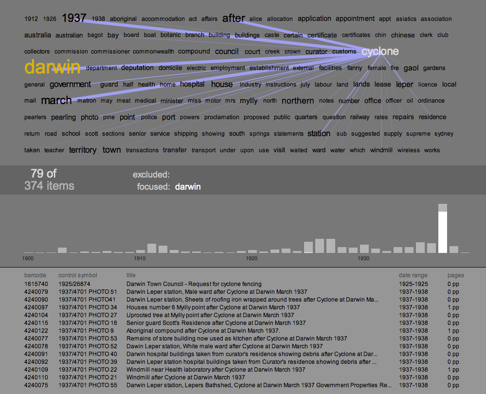
A second example of how the text cloud, co-occurrences, and histogram can combine to reveal patterns in the dataset, and prompt discoveries in the content of the series. Focusing in on "Darwin" reveals another big spike in the histogram, this time in the year 1937. In this case, the co-occurrences and the distribution of terms give an accurate preview of what the items in that spike are about: a cyclone hit Darwin. The text cloud even reveals the month of the event, and again the item listing shows fine-grained confirmation of the pattern.
The final challenge in this process was to zoom in again, to the level of the individual document. The Archives has digitised a significant chunk of its records - it currently stores 18.2 million images which are accessable through the search interface of RecordSearch. With the invaluable help of the Archives' Tim Sherratt, I can access these images dynamically by passing item details - barcode and page number - to an Archives PHP script. Because the dataset I am working with does not record the number of digitised pages, this is a two-stage process: first, query RecordSearch for the item details, and scrape out the number of digitised pages (shown in the right hand column of the items listing). Then, when an item in the list is clicked, load and display the page images.
This involved getting around a couple of little technical issues. The loading of the images was surprisingly straightforward. Processing's requestImage() function happily grabs an image from the web without bringing the entire applet to a halt. Loading the pages data was slightly harder, because loadStrings() does halt everything while it waits; and in this case, I wanted to load up to 14 URLs at a time. Java threads provided the solution - another case where Processing's ability to call on Java for backup was extremely useful.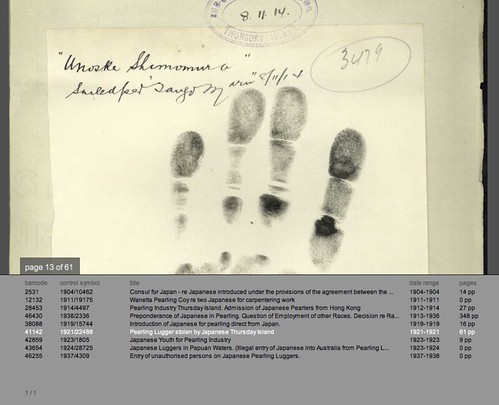
The first time I successfully loaded one of these scans - a crinkled, typewritten page, encrusted with notes - was a real thrill. What this shows is that given the opportunity, interactive visualisation can provide not only insights into the structure and content of an archival collection; it can also provide an interface to the (digitised) collection itself. If the text cloud and histogram visualisations hint at historical events in the items content, the page images let us verify or explore their leads in the primary sources. For example in the 1927 deportation items above, the digitised documents reveal cases where recent migrants were deported to their country of origin because of mental illness. The Immigration Act (1901-1925), quoted in these documents, gives the Minister the power to deport recent arrivals who are convicted criminals, prostitutes, or "inmates of insane asylums." Not what I expected to find - but that's good, if the aim here is exploration. There's an amazing wealth of material in here - and it is beautifully material: the screen grab above shows a page from item 1921/22488, which documents the theft of a pearling lugger by its (indentured) Japanese crew. This page shows a handprint of one of the men, Unoske Shimomura, taken in 1914.
You can download the A1 Explorer applet for Mac, Windows and Linux (each is a 1.8Mb Java executable). System requirements are pretty minimal, though you will need a network connection to load images. One more caveat: the user interface is very rudimentary - again UI is not the focus of my research here - so below is a quick cheat sheet that should be enough to get you going. I'd love to hear your feedback on it, or any interesting discoveries you've made.
A1 Explorer Cheat Sheet
Text Cloud view
- hover over words to see correlations, item distributions and numbers
- click a word to load a list of its items into the lower pane
- to exclude a word and regenerate the cloud hold down '-' and click the word
- to focus on a word hold down '+' and click the word
- to remove a focused or excluded word, click on it in the central info bar
- use the up and down arrow keys to scroll through the items list in the lower pane
- click on an item in the list to load its page images and switch to document view
- page through the document with the left and right arrow keys
- drag the page image to move it
- press 'Z' to zoom the image up
- press 'H' to load a higher-resolution image of the current page
- press 'T' to revert to text-cloud view
The final phase of the project was to focus in on Series A1, and explore techniques for visualising the items it contains. First, a few basic stats on the task at hand. A1 contains some 64,000 registered Items, dating largely from the period 1903-1939. It was recorded to by Agencies including the Department of Home Affairs, the Department of the Interior, and the Department of External Affairs. In the dataset I am working with, each Item has a title, contents start and end dates, a control symbol, and a barcode. Other than dates, the most informative data here about the contents of the item, is the title. That raises some interesting problems: the title is a more or less unstructured field of text. Titles range from "August ZALEWSKI - naturalisation." to "International conference re Bills of Exchange [0.5cm]" and "Northern Territory. Pastoral Permit No.256 in the name of C.J. Scrutton."
The initial approach was to use simple word-frequency techniques to gain a sense of the range and distribution of text in the titles. If we take all 64,397 titles, and split them into their constituent words, and exclude some uninteresting words ("of","and","to","with","the","for", "from") the 150 most frequently occuring words look like this. Note that here text size is proportional to the square root of the word count - in other words text area is proportional to word frequency.
Naturalisation and certificate jump out fairly dramatically. In fact looking at the numbers, over 47000 items contain "naturalisation" - that's around 73% of the Series. Some 17,500 items contain "certificate" - 27%. A quick inspection of the records verifies this impression: the vast majority of the records listed are naturalisation certificates, or similar documents. Also notable in this image is the large number of names. Browsing the records suggests that these appear because the naturalisation documents always include the applicant's name. But underneath these layers are a wide range of more descriptive terms: "war", "papua", and "immigration", for example. Despite the dominance of the naturalisation records, the coverage of this list - the number of items with title words appearing in it - is quite high: over 60,000 of the 64,000 records are represented here, about 94%.
The text cloud gives an effective overview of the collection titles, compressing a huge mass of textual content into a single screen. But 6% of that content is unrepresented here; if this is our interface to the collection, that 6% is effectively invisible. As an initial experiment, I regenerated a cloud that excluded all items containing "naturalisation". The resulting cloud (below) covers some 14,500 items; as expected the names have all but disappeared, but more interestingly there are a rich set of new descriptive terms that were previously buried under the naturalisation records. If we add the coverage of this cloud and the first (14,571 plus the 47,058 containing "naturalisation") we get a total coverage of about 96%; so some, but not all, of that invisible 6% is now represented.
The other addition here uses interaction to extract more information from the cloud. One disadvantage of text clouds is the way they relentlessly decontextualise, breaking the local relations between terms. The lines between terms here - displayed on rolling over each term in the cloud - are an attempt to restore some of that context. They show links between terms that occur together in Item titles; so in the image above we can see that "new" occurs with "guinea" very frequently (not suprisingly). More informative though is that "employment" and "staff" are also correlated. Note also that "papua" is not strongly correlated with "guinea" - a bit of history explains why; Papua and New Guinea were administratively separate until 1945. So here a simple interactive visualisation device adds new context to the display and prompts new questions about the content.
In the next post: expanding these techniques into an interactive browser that can take us from a whole-Series view, to an image of a specific document, in a few clicks.
In a comment on the last post, Tim Sherratt observed that there seemed to be fewer links between Series than there should be. I did some digging in the data and discovered that links in the Archives' data are uni-directional. In other words, when Series A lists Series B as a related Series, Series B does not automatically reciprocate. The same is true for succession and control relationships: Series data lists subsequent Series links, but not preceding Series (which are subsequent Series relationships in reverse). Controlling links are listed, but not controlled by relationships.
In order to represent these links I first had to rewrite the parsing code so that when it finds a link, it simply records the link in two Series - at both ends of the link - rather than one. Thinking about directionality I decided that succession links all could be represented in the same way, regardless of direction: since the grid layout shows chronological ordering, that relationship is already clear (succession relationships are blue, above). Related Series could also be represented symmetrically - if Series A is related to Series B, surely B is also related to A (related links are yellow, above). Control relationships however are highly directional, so I introduced a new link type to represent the controlled by relationship. In the image above the controlled by links are purple, and lead from a large series to a number of smaller ones.
This tweak has a number of important results. Not surprisingly, the number of links increases - it doubles, in fact - providing more impetus to expore the context around a focused series. Also, the addition of the controlled by relationship makes small controlling Series far more findable because they are often linked from large Series, as in the image above.
Update 20th August - updated these sketches to fix a memory allocation problem
The latest step in building a browsable Series-based visualisation has been to add in Agency data. The previous post made a first step towards integrating Agencies into the visualisation - essentially using their ID codes to colour the Series squares. But Agencies also offer a powerful way to add context to our visual exploration of the Archives collection, as this post will show. To skip straight to the latest visualisation, download the executables for Mac, Windows or Linux (about 5Mb each - and needs 1280x1024).
To begin with I wanted to get a sense of the quantitative relationships between Series and Agencies. After converting the Series dataset to JSON and ingesting it to Processing, I generated some simple "utility" visualisations.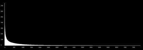
This graph shows all 9000 or so Agencies in my dataset, ranked in order of the number of Series that they record into. Agencies are arranged from left to right along the x axis; number of Series recorded is graphed on the y axis (click the graph to see a larger version over on Flickr). This shape is a classic power law distribution: there are a very small number of Agencies recording a large number of Series, and conversely, very many Agencies recording very few Series. For example, there are only around 100 Agencies that record to more than 100 Series; and the vast majority of Agencies record to very few series (less than 10, say).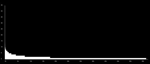
This graph shows the same relationship from the other side: here Series are ranked along the x axis, and the y axis shows the number of Agencies recording into each Series. Again this is a power-law distribution, but the quantities are much smaller. We can see that around two thirds of all Series have only one recording Agency; almost all have fewer than 10; and a tiny number have as many as 45.
Where does this get us, in terms of making a visualisation of the whole collection? It shows that Agencies offer a useful way to break the collection up into manageable-sized subsets; the vast majority of Agencies record to fewer than 100 of the 57.5 thousand series. That's a significant refinement. At the same time most Agencies record to more than Series: so Agencies should be able to show relationships between usefully-sized groups of Series.
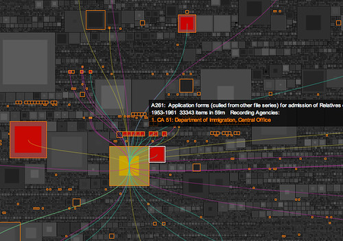
The next step was to integrate the full Agency data with the previous Series visualisations; this was relatively straightforward, and again HashMaps were invaluable in cross-linking Series and Agency data. I rebuilt the floating caption display, to handle a complete listing of recording Agencies and their titles. This alone adds a wealth of context to the visualisation: Series with relatively generic titles ("Correpsondence files") are brought into focus with a descriptive list of their Agencies.
For each browsed Series, we can then show other Series recorded to by its Agencies. In the interactive sketch we can select a Series with a mouse click, turn on the Agency display (hit "A"), then scroll through the agencies with the arrow keys. The floating caption box allows us to investigate highlighted Series, select them in turn, and so on. The result is contextually rich and far more browsable than before. The scale of these Agency-based groups is, as the first graphs show, an effective way to break the collection down. The highlights give a slight counterbalance to the size-based bias of the packed-square visualisation, leading us out into smaller series. Also, because the floating caption shows all the Agencies for each highlighted Series, we build up a sense of the range of related Agencies in a certain area; so highlighting CA 51, the (mid-century) Department of Immigration (Central Office), and browsing its Series, reveals other immigration-related Agencies. Have a browse: download the visualisation as a Java executable for Mac, Windows or Linux (about 5Mb each - and needs 1280x1024).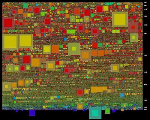
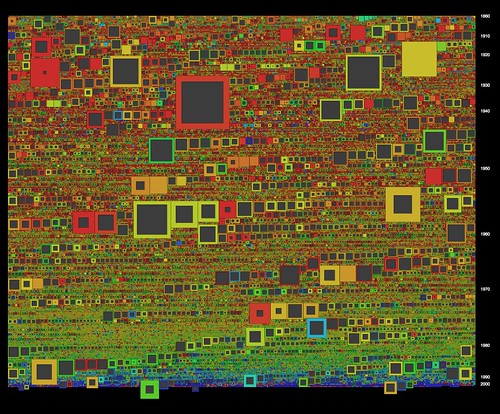
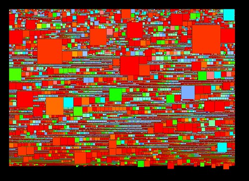
Finally, these latest visualisations also include an important tweak in the packed-square visualisation model. Tim Sherratt commented on an earlier post that the "hollow box" metaphor is potentially misleading, because it's based only on the ratio between shelf metres and recorded items. In other words, the way that a "hollow" suggests un-registered items is just not right. While browsing these visualisations I came across another, more serious problem with the "hollow" approach. Because the overall size of a square is determined by its shelf space, it's possible to have very small squares that represent Series with many thousands of recorded items; as many or more than physically larger Series. The solution is simple, once you think of it: visualise both items and shelf metres. Now, the area of the inner (brighter) square is proportional to items; while area of the outer (duller) band is proportional to shelf metres. The result is that Series that are physically small, but contain many items, suddenly grow in size ( in the visualisation these appear with very thin borders). Interestingly some very recent Series pop out, including a couple documenting the 2005 UN Oil-for-Food / AWB inquiry: with zero shelf metres, I wonder if these are "born digital" records?
This will be the final step, for the moment, in visualising the whole collection. With a public lecture at the Archives coming up I need to move on to the Items level, visualising the contents of A1. More on that shortly.
[update - the links to the executables were broken, sorry: fixed now (11 May)]
After a hiatus over summer and the start of the academic year, I finally have some more progress to report. Using the packed square visualisations as a base, I've been adding more data elements from the Series dataset, and working towards visualising relationships between Series and the Agencies that generate their content. This has taken longer than planned due to more data-plumbing issues, which I'll come to later.
The Archives' Series data records two kinds of links: Series-Agency and Series-Series. The latest sketches make a start in visualising both of these. Here colour (or more accurately hue) is derived from the first listed Recording or Controlling Agency. As the CRS Manual explains, the Recording Agency generates the records; while the Controlling Agency is the "agency currently responsible for some or all of the functions or legislation documented in records." In either case, given that there are some 9000 Agencies involved here, how do we visualise this link? For the moment I'm doing it in the simplest possible way: low Agency numbers have low hue values (red), while high Agency numbers have high hue values (blue to purple). There are a number of problems with this - notably that it's impossible to tell the difference between, for example, CA 11 (Treasury 1901-1976) and CA 12 (the PM's Department 1911-1971) - which is a very significant difference. These two images show the difference between visualising Recording Agency (top) and Controlling Agency (bottom).

Series data also records links to other Series, which come in three flavours: Succession (between previous and subsequent series), Controlling (where one Series acts as an index or register for another) and Related (for other relationships). In this dataset (57.5k Series) there are some 7.5k succession links, 6.2k controlling series links, and 25k related series links. My initial attempt to render all of these (by just drawing a line between linked Series) resulted in a giant, unreadable cloud. A simpler and more legible approach is to only draw links for one Series at a time.
In the latest interactive sketch, a single Series' links are drawn as coloured lines: controlling links are red, succession links are blue, and related Series links are yellow. Clicking a Series selects it and draws its links, rendering linked series in colour while dimming the rest to grey (clicking the Series again unselects it and returns to Technicolor mode). This begins to show the potential for a visual interface to the collection, I think. Here's the applet - note that it's fairly screen and memory-hungry. Feedback welcome, as always.

There are a few changes behind the scenes here as well. As outlined earlier, XML has been a mixed blessing: easy to use and human-readable, but the file sizes are large, and the DOM parsing method used in Processing is memory-hungry and slow. For these sketches I've switched to JSON, a simple, lightweight data format with its own Java library. So far, JSON is working nicely; its file sizes are around half those of the equivalent XML files, parsing is much faster, and the parsing code is simpler and neater. This thread has lots of useful info on implementing JSON in Processing.
HashMaps are the other new toy here. I'd never quite found a use for them until now, but because they easily connect an object (in this case a Series) with an index string (in this case a Series ID), they are essential here for building Series-Series links. I simply store each Series' links as a list of ID strings, then to draw the link, feed each ID into a HashMap to access the whole Series object. Thanks to @blprnt and @toxi for reminding me why I needed HashMaps!
Next: digging deeper into the complexities of Agency-Series relations.
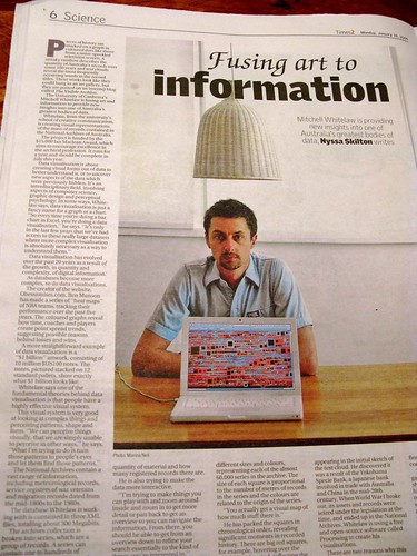 The Visible Archive project was in the Canberra Times yesterday, with a nice full-page feature written by Nyssa Skilton (photo by Marina Neil). Frankly I would have preferred more of the visualisations and less of my quizzical mug but it's not a bad photo. If you've arrived here via the CT, welcome, and have a look around...
Up to this point the grid visualisations have taken a very simple approach to space: dividing it up equally among the data points, and then using hue and brightness to show attributes such as shelf metres and items. This has the advantage of simplicity, but it has a major disadvantage too: it's attempting to represent size (shelf metres or number of items) using other means. Why not just use size for size? Read on for the blow-by-blow account, or skip straight to the end result: the latest interactive sketch.
Before Christmas I had a first stab at this problem. The approach was basic, as usual. Maintaining the chronological ordering of the series, I drew each series as a square with area proportional to number of items. The packing procedure was simply: starting where the previous series is, step through the grid until we find a big enough space to draw the current series. The result looked like this: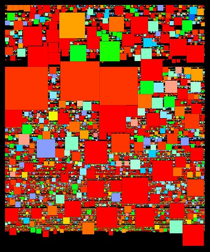 After weeks of regular grids, this was a sight to see. The distribution of the sizes of series (overall and through time) is instantly apparent. This ultra-simple packing method is far from perfect, though, as you can see from all the black gaps. Because it tiles one series at a time, in strict sequence, and only searches forwards through the grid, gaps appear whenever a large square comes up as the search scrolls along to find a free space.
The main restriction here is the chronological ordering of the series. I need to maintain that ordering, but at the same time I need to be able to pack the squares more efficiently, which means changing the order. Luckily there's a loophole: as the first histogram showed, many series share the same start date. So we can change the sequence of those same-year series, without disrupting the overall order. We can pack them starting with the biggest squares and pack in the smaller ones around them. The latest sketches use this method, which can be described in pseudocode:
- Make a list of series with a given start year
- Working from biggest to smallest, pack each series into the grid, from a given start point: restart the search from the start point each time.
- Keep track of the latest point in the grid that this group occupies. For the following year, start from this point.
 In this image square area is mapped to shelf metres; as in the earlier sketch hue is derived from the series prefix (roughly A = red, Z = blue). One artefact is apparent here - those lines of squares graded by size occur when nothing gets in the way of the packing process. As a byproduct of this, the biggest squares in those sequences often mark the start of a new year in the grid.
The latest sketches integrate both shelf metres and described items, and finally add interaction to this visualisation. To combine metres and items the squares are drawn as above, with area proportional to shelf metres; then overlaid with a second grey square, whose size is inversely proportional to the number of items in the series. The result is that series with many items are full of colour, and series with few items have large "hollows" and narrow coloured borders.
 Again, there are relations between series here that are instantly apparent. It's easy to see those series that have lots of shelf metres but relatively few items, as well as even medium-sized series with many items. I couldn't find A1 in the earlier grids (though Tim Sherratt from the Archives could); it is much more prominent here. Tim also pointed out that B2455, one of the big series of WWI service records, didn't jump out of the grids: it's very prominent here. As well that cluster of post-War migration series spotted in the items grid reappears here. Promising signs for the usefulness of this visualisation.
All this is best demonstrated in the interactive version, which like the previous grids adds a caption overlay and some year labels on the vertical axis. Browse around and see what you can find - feedback very welcome.
