The final phase of the project was to focus in on Series A1, and explore techniques for visualising the items it contains. First, a few basic stats on the task at hand. A1 contains some 64,000 registered Items, dating largely from the period 1903-1939. It was recorded to by Agencies including the Department of Home Affairs, the Department of the Interior, and the Department of External Affairs. In the dataset I am working with, each Item has a title, contents start and end dates, a control symbol, and a barcode. Other than dates, the most informative data here about the contents of the item, is the title. That raises some interesting problems: the title is a more or less unstructured field of text. Titles range from "August ZALEWSKI - naturalisation." to "International conference re Bills of Exchange [0.5cm]" and "Northern Territory. Pastoral Permit No.256 in the name of C.J. Scrutton."
The initial approach was to use simple word-frequency techniques to gain a sense of the range and distribution of text in the titles. If we take all 64,397 titles, and split them into their constituent words, and exclude some uninteresting words ("of","and","to","with","the","for", "from") the 150 most frequently occuring words look like this. Note that here text size is proportional to the square root of the word count - in other words text area is proportional to word frequency.
Naturalisation and certificate jump out fairly dramatically. In fact looking at the numbers, over 47000 items contain "naturalisation" - that's around 73% of the Series. Some 17,500 items contain "certificate" - 27%. A quick inspection of the records verifies this impression: the vast majority of the records listed are naturalisation certificates, or similar documents. Also notable in this image is the large number of names. Browsing the records suggests that these appear because the naturalisation documents always include the applicant's name. But underneath these layers are a wide range of more descriptive terms: "war", "papua", and "immigration", for example. Despite the dominance of the naturalisation records, the coverage of this list - the number of items with title words appearing in it - is quite high: over 60,000 of the 64,000 records are represented here, about 94%.
The text cloud gives an effective overview of the collection titles, compressing a huge mass of textual content into a single screen. But 6% of that content is unrepresented here; if this is our interface to the collection, that 6% is effectively invisible. As an initial experiment, I regenerated a cloud that excluded all items containing "naturalisation". The resulting cloud (below) covers some 14,500 items; as expected the names have all but disappeared, but more interestingly there are a rich set of new descriptive terms that were previously buried under the naturalisation records. If we add the coverage of this cloud and the first (14,571 plus the 47,058 containing "naturalisation") we get a total coverage of about 96%; so some, but not all, of that invisible 6% is now represented.
The other addition here uses interaction to extract more information from the cloud. One disadvantage of text clouds is the way they relentlessly decontextualise, breaking the local relations between terms. The lines between terms here - displayed on rolling over each term in the cloud - are an attempt to restore some of that context. They show links between terms that occur together in Item titles; so in the image above we can see that "new" occurs with "guinea" very frequently (not suprisingly). More informative though is that "employment" and "staff" are also correlated. Note also that "papua" is not strongly correlated with "guinea" - a bit of history explains why; Papua and New Guinea were administratively separate until 1945. So here a simple interactive visualisation device adds new context to the display and prompts new questions about the content.
In the next post: expanding these techniques into an interactive browser that can take us from a whole-Series view, to an image of a specific document, in a few clicks.
In a comment on the last post, Tim Sherratt observed that there seemed to be fewer links between Series than there should be. I did some digging in the data and discovered that links in the Archives' data are uni-directional. In other words, when Series A lists Series B as a related Series, Series B does not automatically reciprocate. The same is true for succession and control relationships: Series data lists subsequent Series links, but not preceding Series (which are subsequent Series relationships in reverse). Controlling links are listed, but not controlled by relationships.
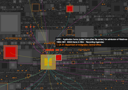
In order to represent these links I first had to rewrite the parsing code so that when it finds a link, it simply records the link in two Series - at both ends of the link - rather than one. Thinking about directionality I decided that succession links all could be represented in the same way, regardless of direction: since the grid layout shows chronological ordering, that relationship is already clear (succession relationships are blue, above). Related Series could also be represented symmetrically - if Series A is related to Series B, surely B is also related to A (related links are yellow, above). Control relationships however are highly directional, so I introduced a new link type to represent the controlled by relationship. In the image above the controlled by links are purple, and lead from a large series to a number of smaller ones.
This tweak has a number of important results. Not surprisingly, the number of links increases - it doubles, in fact - providing more impetus to expore the context around a focused series. Also, the addition of the controlled by relationship makes small controlling Series far more findable because they are often linked from large Series, as in the image above.
Update 20th August - updated these sketches to fix a memory allocation problem
