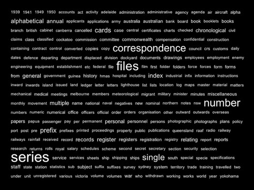
So, it's no Wordle, but it's my first text cloud. This visualises the 250 most common words in the titles of each series in the initial dataset. It's also the first time I've mined the titles for data, and another step in the process of feeling out the attributes of this dataset. I've excluded a few "stop" words ("and","with","the","for") and anything with less than three characters, but otherwise this is a raw representation of the titles.
It shows first of all that the most frequently occuring terms in series titles are either generic descriptors ("files", "correspondence") or metadata, referring to the organisation or structure of the series, rather than its content ("alphabetical", "prefix", "single"). But then after the top twenty or so words, there's a large number of more descriptive terms. The difference in scale between these layers is significant; for example "series" and "files" occur in around 10,000 series titles (about a third of all series), whereas "drawings" occurs in around 800 series, and "HMAS", "Papua" and "Lighthouse" all occur in around 200 series. Some odd features show up as well, for example "Yokohama" and "specie"; turns out there are a large number of series consisting of records from the Yokohama Specie Bank, a Japanese bank involved in trade with China and Australia around the mid-C20th - it gets a mention in this 1940 telegram from Menzies to the High Commissioner in London. I wonder how the records ended up in the Archives?
Next, to try integrating text clouds as interfaces / overlays for the previous visualisations.
I've been considering how to develop the stack histograms, but meantime decided to quickly trial a completely different approach to visualising the Series dataset. I don't want to get carried away with one metaphor / approach, when there may be others worth exploring. So, in this visualisation some 27000 series are layed out in a simple grid. Series are ordered by (contents) start date, and sequenced left to right, top to bottom. As in the last histograms, date span is mapped to hue, so long spans are blue, short spans are red. I've been having some weird issues with web applets so far, but this one seems to work (without OpenGL), so there's also an interactive version to play with.
This layout has a number of advantages over the stack approach. The primary one is visual density. This layout makes it possible to see all the series, in a single visual field. In the examples here the grid is 200 columns wide and around 135 rows high; each series is a 4 x 4 pixel square. Even allowing for 40000 series in an expanded dataset (more of which soon), this scale is functional. A related advantage is browsability. In the interactive version of this sketch, we can simply mouse over series to see their details; a usable, if still unstructured way to browse the collection.
The grid throws away the emergent histogram-form of the stack approach. However many related structures are still apparent: for example the pattern of long-span series having early start dates is clear; and the interactive version also reveals the date distribution; the reddish band in the middle of the grid is the wave of short series around WWII. One thing on the list to try is add a date key to the vertical axis. This would effectively show the same thing as the tall peaks of the original histogram: the relative numbers of series commencing over time. The grid simply structures space according to the data elements (the series), so that the relation of date to visual space becomes nonlinear; but the relationship is still there and easily revealed.
Next on the list of things to try is a word-frequency visualisation based on series titles. This should provide a way to browse the grid more effectively; after that, I need to get to work on a new, expanded dataset with more series, but also useful quantitative measures like shelf space and digitised items, for each series. Then, more layers of structure and browsability: relationships between series, agency and function.
Labels: grid, interactive, series, sketch