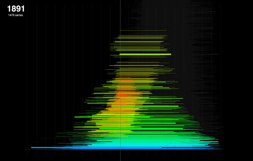
I've been developing the year-span histograms posted earlier. In these sketches, the series are again represented as single horizontal lines that correspond to their date spans. To address the problem of series overlapping each other, this sketch sorts and stacks the series into a single big, non-overlapping heap. The method is fairly simple. First, sort all the series by their span, longest to shortest (this involved learning to implement Java's Comparable function). Then, place the series in the stack, longest to shortest, bottom to top. A simple 2D array is used to keep track of series positions and check collisions; if a collision is found, simply try the next row up and repeat until a space is found.
The result is almost, but not quite, a histogram (because the packing isn't perfect - there are some gaps). Unlike the earlier sketches though, it visualises the total number of series spanning a given year, rather than just the commencing year; this seems a more generally useful feature to visualise. It's interesting to note though that some of the features obvious in the commencing year histogram are less clear here - notably the spikes around Federation and the Wars.
The real payoff for the stacking is that now we have a potential interface to the entire collection, at series level. Adding interaction makes it easy to browse the visualisation by year, showing the relation between series in that year and the total collection. Sheer scale is still a problem. This "heap" is more than 10,000 series high - too big to usefully show every series even at one pixel each. Interaction allows zooming and panning (above), which helps. Next, I'd like to be able to filter the heap down to a more manageable size, to a point where this can become the interface to browse through individual series.
Labels: histogram, interactive, sketch, stack
0 comments:
Post a Comment