 The Visible Archive project was in the Canberra Times yesterday, with a nice full-page feature written by Nyssa Skilton (photo by Marina Neil). Frankly I would have preferred more of the visualisations and less of my quizzical mug but it's not a bad photo. If you've arrived here via the CT, welcome, and have a look around...
Up to this point the grid visualisations have taken a very simple approach to space: dividing it up equally among the data points, and then using hue and brightness to show attributes such as shelf metres and items. This has the advantage of simplicity, but it has a major disadvantage too: it's attempting to represent size (shelf metres or number of items) using other means. Why not just use size for size? Read on for the blow-by-blow account, or skip straight to the end result: the latest interactive sketch.
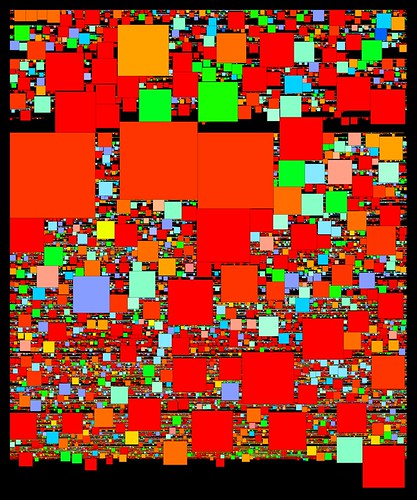
Before Christmas I had a first stab at this problem. The approach was basic, as usual. Maintaining the chronological ordering of the series, I drew each series as a square with area proportional to number of items. The packing procedure was simply: starting where the previous series is, step through the grid until we find a big enough space to draw the current series. The result looked like this: After weeks of regular grids, this was a sight to see. The distribution of the sizes of series (overall and through time) is instantly apparent. This ultra-simple packing method is far from perfect, though, as you can see from all the black gaps. Because it tiles one series at a time, in strict sequence, and only searches forwards through the grid, gaps appear whenever a large square comes up as the search scrolls along to find a free space.
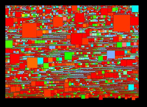
The main restriction here is the chronological ordering of the series. I need to maintain that ordering, but at the same time I need to be able to pack the squares more efficiently, which means changing the order. Luckily there's a loophole: as the first histogram showed, many series share the same start date. So we can change the sequence of those same-year series, without disrupting the overall order. We can pack them starting with the biggest squares and pack in the smaller ones around them. The latest sketches use this method, which can be described in pseudocode:
- Make a list of series with a given start year
- Working from biggest to smallest, pack each series into the grid, from a given start point: restart the search from the start point each time.
- Keep track of the latest point in the grid that this group occupies. For the following year, start from this point.
 In this image square area is mapped to shelf metres; as in the earlier sketch hue is derived from the series prefix (roughly A = red, Z = blue). One artefact is apparent here - those lines of squares graded by size occur when nothing gets in the way of the packing process. As a byproduct of this, the biggest squares in those sequences often mark the start of a new year in the grid.
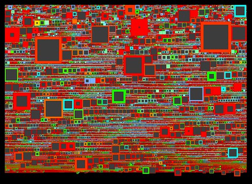
The latest sketches integrate both shelf metres and described items, and finally add interaction to this visualisation. To combine metres and items the squares are drawn as above, with area proportional to shelf metres; then overlaid with a second grey square, whose size is inversely proportional to the number of items in the series. The result is that series with many items are full of colour, and series with few items have large "hollows" and narrow coloured borders.
 Again, there are relations between series here that are instantly apparent. It's easy to see those series that have lots of shelf metres but relatively few items, as well as even medium-sized series with many items. I couldn't find A1 in the earlier grids (though Tim Sherratt from the Archives could); it is much more prominent here. Tim also pointed out that B2455, one of the big series of WWI service records, didn't jump out of the grids: it's very prominent here. As well that cluster of post-War migration series spotted in the items grid reappears here. Promising signs for the usefulness of this visualisation.
All this is best demonstrated in the interactive version, which like the previous grids adds a caption overlay and some year labels on the vertical axis. Browse around and see what you can find - feedback very welcome.
Labels: grid, interactive, packing, series, sketch